Business Analysis
Contents
Visual Tools and Model Development
Organizations require effective layouts of information to understand results, discover patterns, tabulate findings and develop strategies based on this data. I continue to develop and deploy a variety of models, reports and visual analysis tools utilizing a wide variety of applications to help businesses uncover information. My current set of tools that I find useful in communicating concepts in the contact center space leverage newer platforms that allow you to deploy models to the web. Below are some samples of dozens of use cases.
Cost of Attrition Calculator
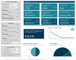
A dynamic workforce management (WFM) Cost of Attrition designed to demonstrate to executives the comprehensive financial impact of contact center turnover. The calculator reveals how attrition costs extend far beyond obvious training and onboarding expenses by incorporating speed to proficiency losses.
Key Features
Three-Component Cost Analysis
- Training Investment: Direct costs of new hire training programs
- Onboarding Expenses: HR, recruiting, and IT provisioning costs
- Speed to Proficiency Impact: Often-overlooked productivity loss during ramp-up period
Executive Insights
- Learning curve visualization showing 12-month productivity ramp
- Side-by-side comparison of base vs. attrition-impacted budgets
- Clear demonstration of how 50% attrition can increase operational costs by 20-25%
- Cost per replacement metric for executive reporting
The calculator serves as a powerful tool for workforce planners to demonstrate why investment in retention strategies often costs less than the hidden burden of high turnover.
Forecast Accuracy vs. Minimal Interval Variance Calculator
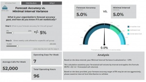
A diagnostic tool that helps workforce managers evaluate whether their forecast accuracy goals are realistically achievable based on mathematical principles of minimal interval variance (MIV). This calculator challenges the common practice of setting arbitrary forecast accuracy targets by demonstrating how queue size inherently limits achievable accuracy.
Key Concepts
Minimal Interval Variance
- Mathematical lower limit of variance based on queue size
- Calculated using formula: MIV% = √(2 / (π × forecasted call volume))
- Demonstrates why smaller queues naturally experience higher variance
Calibration Features
- Adjustable forecast accuracy goals (0-20%)
- Flexible weekly call volume inputs (10,000-200,000)
- Operating days and hours configuration
- Visual gauge showing relationship between target and MIV
Business Value
Helps organizations set realistic forecast accuracy targets Prevents unfair performance evaluations based on unattainable goals Demonstrates why different-sized queues require different accuracy expectations Supports data-driven adjustment of service level agreements
The calculator provides immediate visual feedback through a gauge display, showing whether selected accuracy goals are:
Unrealistic (below MIV threshold) Calibrated (appropriately set) Conservative (potentially too lenient)
Shiny & R Studio
R Studio and Shinyapps allow dynamic visualization and working models, exposing to an online interface. These are still useful today, and I host them as a ShinyApp. In this example, we've created an online visualization of the "Power of One" - showing the importance of how losing (or gaining) a single call center rep can dramatically impact interval service level.
Tableau Visual Analytics
- Cost Per Call Exceeds Cost To Maintain Service Level
- Why transfer skills require preference level equal to primary
- Gating Strategy & ASA ABA Relationship Study
- Service Level, Abandon and ASA Relationship Study
- Top 10 Cost Reduction Strategies
Xcelsius Models
Resource management requires the analysis of many scenarios to develop effective, cost-efficient strategies for staffing call centers against demand. To assist in the visualization of the impact in changing variables within a model, I have developed a series of call center calculators. Back in the day, these Xcelsius calculators we're a great way to show people interactive calculators. Today, I use tools like Molnify, Squirrel365, DeepNote and Colab to build dynamic, interactive apps to illustrate concepts.
What-If Improvement Models
Call centers are frequently challenged to improve various metrics to lower operational costs; reducing shrinkage, improving AHT, cutting out repeat calls or volume reduction in general, or obtaining higher levels of occupancy. The following calculator was developed to visualize the financial impact when assumptions around improving any or all of these variables were made.
This calculator is powerful in demonstrating that while initial returns can be significant, long-term reduction in operations costs to call centers requires both tight workforce management and a sustained effort to effectively shift customers self-service models for appropriate inquiries.
Headcount Capacity Calculator
How many calls can 100 reps handle, based on ___% Shrinkage and ___% Occupancy for a pool of calls which average ___ AHT? Often, resource management is asked to determine how many calls can be handled by a pool of representatives. This call calculator allows you to quickly dial in the answer
This calculator also allows you to model the impact that shrinkage has on your total workload which can be handled. Training at 5% vs 6%? Absenteeism at 7% vs 10%? Dial in the questions to determine the impact on call capacity that your pool of agents can handle.
Call Capacity Calculator
Simply the reverse of the above, the call capacity allows you to dial in the projected monthly call volume to determine the number of representatives needed to support that call load. This calculator comes in two flavors - zero to 1 million calls and one for zero to 10 million calls per month.
Service Level Recovery Cost
The Service Level Recovery Calculator utilizes the relationship between running at low service levels for sustained time periods, and the increased average handle time. Many studies show a clear relationship between operating a call center where service level is not met, the result of which is a high occupancy level. When agents do not have natural breaks that occur when maintaining service levels where 80% or more of calls are answered under 30 seconds, AHT extends to create breaks within the actual call itself.
This calculator starts with a 1:1 relationship between SL deterioration and AHT increasing, with 10 seconds added to AHT for every 10 points of service level deterioration. This calculator allows you to adjust this relationship based on the tolerance your workforce has in maintaining the same AHT targets under the pressure of operating with service level deterioration.
This calculator is primarily used to demonstrate the cost of operating at a low service level for a sustained period of time.
Collections Cost Per Call Calculator
The Collections Cost Per Call Calculator was developed to be used in modeling a strategy for introducing attribute routing for calls which originate from a service interruption being initiated to collect payment.
This calculator allows call volumes to be segmented into three buckets, assuming the application of attributes to route calls. Once attributes are applied, and volumes identified, the calculator allows different AHT, Occupancy and labor costs to be applied in order to determine a cost per call by segment, as well as a blended cost per call.
This calculator assumes a basic premise that "High Value" calls are contained with an "internal labor rate" and that "Low Value" calls are contained with an "external labor rate". For the "Medium Value" segment, there is a slider which allows you to segment these calls to any % of resources associated with the internal or external labor rate.
The calculator has you dial in the high value and medium value buckets, with low value calculating the balance based on the two higher segments.
Crystal Xcelsius™
The calculators above are built using Crystal Xcelsius™.
What Is Crystal Xcelsius™?
Crystal Xcelsius™ is a leading edge Microsoft Windows application that brings data to life!
Using breakthrough technology, Crystal Xcelsius™ bridges the gap between data analysis and visual presentations, empowering users of all proficiencies to create visually stunning interactive reports and applications.
With Crystal Xcelsius™, users can communicate data in a clear and powerful style that's appealing to the mind and to the eye.
Crystal Xcelsius™ is intuitive enough for beginners and versatile enough for advanced users. Most importantly, it makes the process of generating reports and applications fun, without requiring users to learn arcane programming languages. With Crystal Xcelsius™, simply pointing and clicking your mouse can create rich interactive presentations.


