Difference between revisions of "Real-Time Cause and Effect Fishbone"
(Created page with "Category:Resource Optimization Center ==Cause and Effect Fishbone Diagram== Cause and Effect Fishbone '''[http:...") |
(No difference)
|
Latest revision as of 11:56, 23 March 2014
Cause and Effect Fishbone Diagram
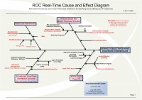
Ishikawa diagrams (also called fishbone diagrams or cause-and-effect diagrams) are diagrams that show the causes of a certain event. Common uses of the Ishikawa diagram are product design and quality defect prevention, to identify potential factors causing an overall effect.[1]
The ROC's use of the Real-Time Cause and Effect Diagram allows consistent diagnosis of what factors are causing service level objectives to not be met, when thresholds have been broken. The diagram paths have 4 major categories which lead to a miss of service level:
- Poor Line Adherence
- Actual Volume Does Not Match Forecast Volume
- Scheduled Line Does Not Match Arrivals
- Average Handle Time Longer than Forecast
Each category has a subset of likely suspects which lead to the major cause. Example: for Actual Volume Does Not Match Forecast Volume, the root cause could be tied to a wide range of events. One example would be a marketing program that was not known or taken into consideration when the forecast was generated. A completely different cause would be a mis-calculation on call reduction initiatives.
Sample Diagnostic Reports
Notes
- ↑ Wikipedia: Ishikawa diagram http://en.wikipedia.org/wiki/Ishikawa_diagram
